.jpg)

I know I haven't been writing a description for the previous posts yet, but that's only because I wanted for it to be a surprise. As with most of my projects (i.e. - my senior project), I had to let myself gel with the idea(s) that I have been working with.
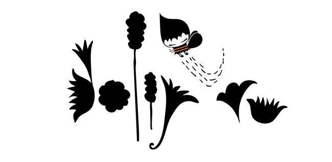
Shown below are my typographic fiction experimentations for my Advanced Graphic Design Seminar ( aka Type III) with the wonderful Erik Brandt. My original idea involved elaborate versal lettering using the Phoenician alphabet. I've also experimented with the mergence of Phoenician forms and Hongul forms and did about 1000+ combinations using old school calligraphy pens and Japanese calligraphy brushes in Indian ink. As you can see in my process shot about three posts below, I did not follow the calligraphy route. Evolution happens, you know.
The concept for this typographic fiction should be self-explanatory. I wanted to explore the fragmentation of these combined forms and play with movement and tension caused by these triangles (those damn trouble-makers)! I have a thing for wood grain. They add a nice texture and a subtle depth to the black forms. Also, looks like they could give you one hell of a blister.
These beautiful collapses will be made into a book, a performance (movie of sorts), and a wheat-pasted poster. A lot of work? yes. Excited? Also, yes.
< end explanation >


2 comments:
I can't wait to see this all put together!
I can't wait either!
Post a Comment